IRIS
state street institutional
trading platform
IRIS was designed to bring together many separate but valuable tools into one platform that could provide the kind of insight that those tools couldn't do apart.
Because the project began without full-time design help, by the time I was brought on as a contractor to help (supporting eight different scrum teams), the user experience was in rough shape.
There was no single source of design truth, so each scrum team was making things up as they went along, creating significant variations in the experience. I made creating a style guide from scratch my highest priority.
While I did that, I navigated a pretty rocky relationship between the teams themselves, and the teams and users. Before I arrived, design thinking was a big part of how the project began, and the traders and operations staff (the users) were a big part of those exercises. But it wasn't communicated to them that the result of the design thinking was going to be vision work, not really buildable in the short term. When the first few features were rolled out to them, and it didn't include a lot of the input the users had given, they were left wondering why they bothered taking time away from their work to be involved. It was one of my key responsibilities to rebuild that trust, and re-engage the users with the process. I did that by sitting with them as they worked, listening and watching the tasks they needed to accomplish, and not requiring them to engage with me. Being fluent in "finance", was extremely helpful, as I could mostly understand what was happening, and I asked intelligent questions when I needed to.
Once I had rebuilt the trust of the users, (obviously an ongoing project) I could focus on building them experiences that added value, a little bit at a time.


STYLE GUIDE
Seven different scrum teams building seven different versions of what they believe to be the best experience. It's every designers nightmare.
I made creating a single source of experience truth my highest priority, even beginning work in MS Paint before I had access to the proper tools.
Here's a couple examples of part of the style guide I created, defining how visualizations would use color and how widget headers could be colored. Before, each widget had its own color palette, and none of them were accessible.

ANNOTATED WIREFRAMES
Because there were so many scrum teams, it was impossible to attend every meeting I needed to. I believe in being as part of the team as possible, including attending daily stand-ups, grooming sessions, story reviews, and all the other Agile ceremonies. But that wasn't possible supporting seven teams. So it was important to give them really good documentation, being much more thorough than I normally would. It needed to be so comprehensive so I could cover more ground across more teams and hopefully field fewer questions while getting high quality work.
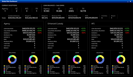

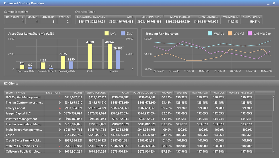
COMPREHENSIVE RISK MANAGEMENT TOOLS
One of the most ambitious features of IRIS was the Risk dashboards, and accompanying full screen drill-downs.
It's designed to give the Risk group a comprehensive view of the overall business, and allows specific focus on each business, client, and fund. It focuses on enabling decisions while prioritizing speed and performance.
Each layer is designed to slide up from the bottom of the screen, which allows you to move forwards and back in your progression of tasks, and always have the information you need to make decisions at your fingertips.

