Visualizations
I've had the opportunity to create some remarkable visualizations over the course of my career. Here's a few I'm most proud of.

Stylized Radar Chart
We needed a visualization that described the both the relationship between a set number of categories (that could get bigger in the future), and give the user a visual indication of which category was responsible for them receiving the alert. I designed this radar chart to give the user an instant recognition of which category is driving the alert.

3-Dimensional Evaluation Cube - Marketing Material
Visualizing ranking brokers along three axes proved to be an interesting design challenge. I created this eye-catching and informative visual to describe how we prioritize order flow and use dynamic scoring as an incentive for brokers to continuously improve. This was part of a series of one-pagers sent to our clients to drive more engagement with the platform.
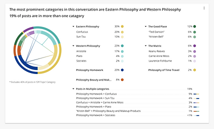
Starburst Chart with Multi-Category Bars
For a specific project, we had tweets that fell into certain categories, and we allowed users to group those categories together. A starburst chart can tell us the categories, and the groups they belong to, but sometimes, tweets fell into multiple categories. I added the multi-category bars to show the amount of tweets that fall into multiple categories.

Option Contract Visualization with Tool-tip
This completely original visualization shows a set of option contracts plotted against the price of a stock. It shows where the price of the stock during the length of the contract, and where it was when the contract expired. Sophisticated investors can use this chart to determine whether it was profitable, given some other factors. This was the very first visualization I designed.

Customer Journey Relationship Map
At Crimson Hexagon, we spent a lot of time defining our personas, and their journeys through the tasks they were trying to accomplish. My primary role in that process was to map out the relationships between the personas, and how they interact. As you can see from the image, we came to realize that whether your job was tactical or more strategic had a direct impact on how you used the product, and which features were important to you. We were able to use this map, and the customer journey, to prioritize what features to build, focusing our efforts to produce the most value for our clients.